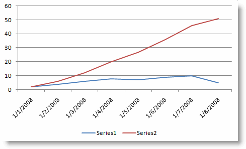
When using Excel and working with two data sets that differ greatly in range it can be difficult to chart those values due to the larger range of one of your data sets. A classic example of this would be your monthly data and your YTD values for each month. When you put these together in a chart the monthly data is diminished by the much larger YTD values. In order to overcome this you can assign each data set an axis.
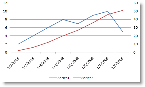
The default for all your data sets is the Primary axis, you have the option of assigning your second data set to the second axis which makes your chart readable. Below you will find the instructions on how to add a second axis to an Excel graph.
If you have any comments or questions, please post them below.
Note: I used Excel 2003 for this demonstration, but it should hold true for 97-2007.
Graph without Second Axis

The following steps were written assuming you have a chart in excel with more than one data set.
If you wish to view the step-by-step, click the pic tutorial icon ->![]() or you can follow the steps below.
or you can follow the steps below.
1. Select a point on the graph for the data set you want to put on the secondary axis.
2. Right-click and select Format Data Series…
3. Click on the Axis tab and select the Secondary axis radio button
4. Click OK
5. Your selected data set should now reside on the second axis of your chart.
Graph with Second Axis Enabled


