The Google Nexus One ships with Android 2.1, this version of Android introduces some pretty neat features and improves on others from the previous release of Android. I will walk you through some of the new features (some not so new, but new to me as a first time Android user) with pictures and videos. Also, a lot of my opinions and commentary are based on having owned a Blackberry, the Pixi, the Pre, and now the iPhone 3GS, so keep that in mind when reading these articles.
If you would like to see a certain feature on video or would like a closer look at something about the phone send me a message @gjperera, Facebook, or just leave a comment below. Thanks for visiting.
1. New Feature – Live Wallpapers // Video
This is the number one feature that really stands out from the Nexus One. These Live Wallpapers are nothing but eye candy, there’s really no other use for them, but to hog memory and burn battery, but boy do they look nice. What I would love to see is the applications/uses that the developer community will come up with using this feature.
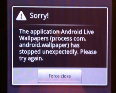
Note: It seems that every time I run the Polar Clock Live Wallpaper it fails to load and I receive the error message below. Anyone else experiencing this?
2. Voice Input for all Text Fields
Voice input is not perfect, but it looks like Google has done a pretty good job tweaking this feature. Overall it did a pretty good job recognizing names in my address book, however I found it had trouble with some of the names with Spanish background and some words. The trick is to speak slowly and clearly and it should work most of the time.
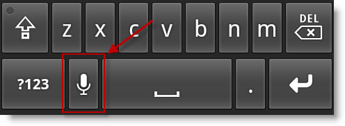
In order to use Voice Input click on the microphone icon highlighted below.
3. Notification Lights
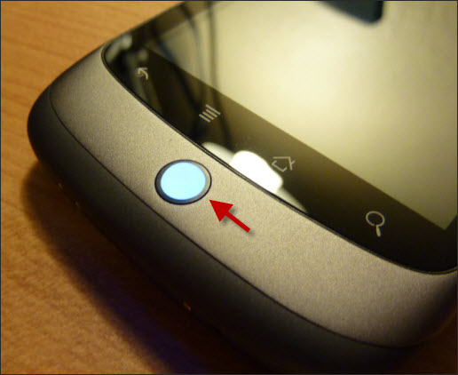
Aside from being used for navigating the phone when you don’t feel like using the touchscreen, the trackball located on the bottom portion of the phone serves as a notification light. So far I’ve seen it light up whenever there is an unread email, text message, and other notifications. The external notification feature (not the trackball) is one of those items that I would really like to find in the next version of the iPhone.
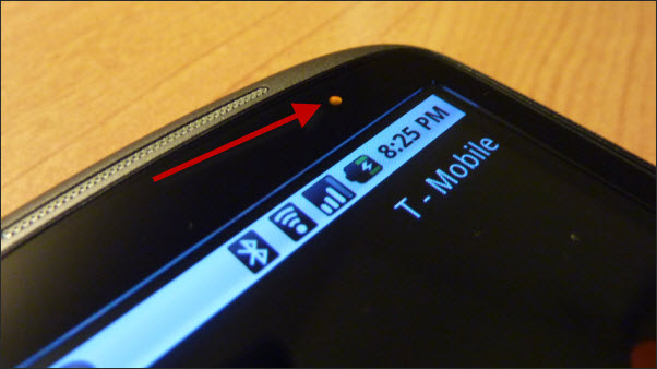
The phone also has a battery charge indicator located on the top right above the screen. This is helpful because there is no need to touch the phone to see whether the battery is charged or not. Orange = Charging, Green = Charged…that simple.
4. The AMOLED Screen
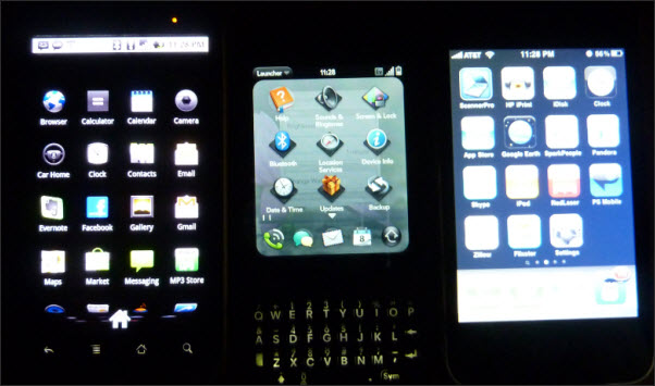
The screen is absolutely gorgeous when compared to the iPhone 3GS and the Palm Pixi. I thought that the pictures in the dark below provided you with the best comparison between these three screens.
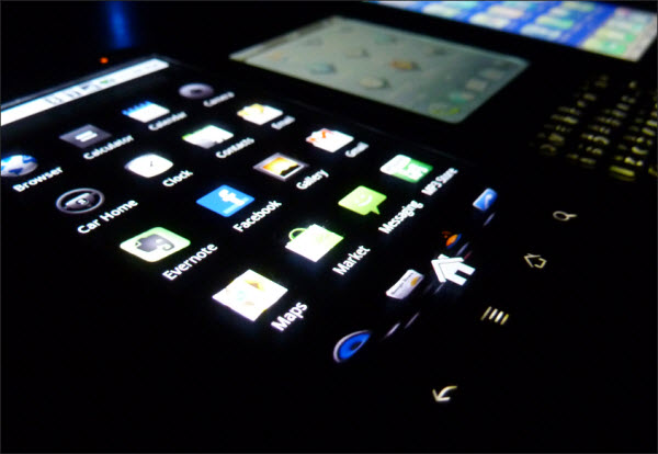
The AMOLED shines in these pictures. The darks remain as such whereas on the iPhone the blacks are almost pale (see image below for a more dramatic comparison).
5. Earpiece with Remote Control
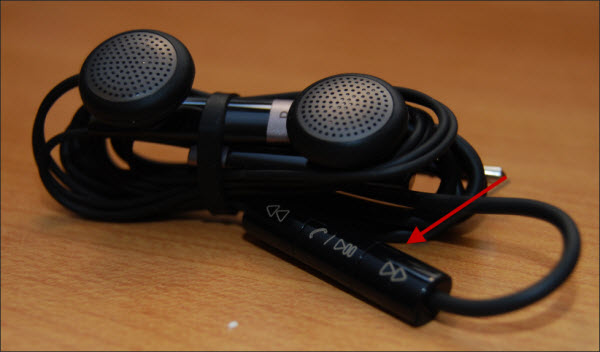
I currently use the iPhone 3GS and appreciate the ability to answer and hang up calls using the earpiece included, however I envy those iPod users that get the control with their earpieces. With the Android I don’t have to envy anyone, the earpiece has a mic AND the music player controls that are so convenient, another plus for me.
6. Noise Canceling Mic
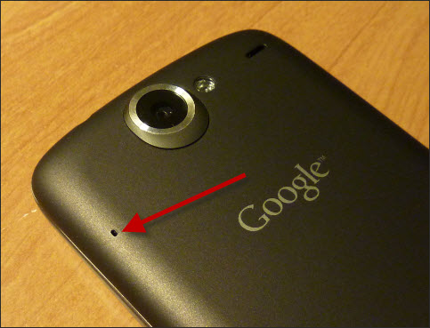
One of the more interesting and useful features introduced in the Nexus One is the use of two microphones in order to allow for noise cancellation. Say goodbye to calls where wind, road noise, or background chatter interfere.
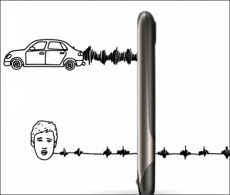
The diagram above is from the Google Nexus One website illustrating the noise cancellation feature found in the phone. Noise originating from sources other than your voice are heard by the second speaker located on the back of the phone and those noises are cancelled out so that the only thing the person on the phone hears is your voice.
7. Drive Mode
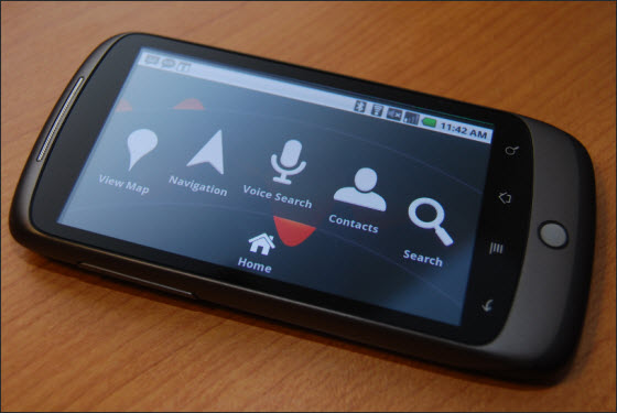
As I understand it this is a standard feature with Android phones, but for those of us not familiar with Android phones this is a really cool application. Car Home allows you to use your phone as a GPS device, yes I know that phones with Google Maps allow you to do the same, but in this case the screen changes to a set of large icons that give you access to functions used during navigation, much like an actual GPS device.
Of course Car Home uses Google Maps so if you’re out of cell coverage you wont be able to re-route or anything like that while off data network. With Voice Search you’ll be able to enter a search query without having to type in an address, all you have to do is hit the Voice Search button.
8. Widget Screens
If you use an iPhone you know that all you get is the home screen or the application you are running. If you need to quickly aces information you need to open the corresponding application in order to access said information. With the Nexus One all you have to do is load up and configure a couple of widgets and you will have access to information simply by unlocking the phone. Not only is this clever, but also very convenient.
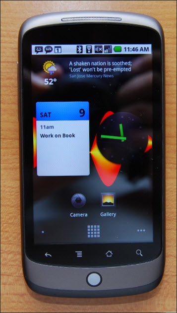
9. Settings Dashboard
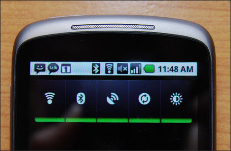
One of the screens that caught my attention was one of the widget screens that contain 5 buttons to quickly and easily control the following settings;
- Wi-i On/Off
- Bluetooth On/Off
- Wireless (cell) On/Off
- Sync On/Off
- Brightness Control
This is a really convenient feature that keeps users from having to go to the settings menu to change frequently accessed settings. I’m all about convenience and this is a plus for me.
10. Design & Dimensions
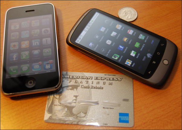
With the exception of the trackball, the four buttons, and the missing chrome bezel the Nexus One at first glance could be mistaken for the iPhone…at least that’s the reaction I’ve seen from others in the past day or so of use. I’ve been asked if this was the new iPhone from Apple.
Since Google will not be selling this phone in a brick and mortar retailer anytime soon, I placed a quarter, and iPhone, and a credit card next to the Nexus One for comparison. I also used a ruler to demonstrate how insanely thin this device is.
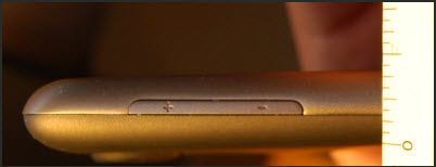
The contoured edges and tapered bottom of the phone make it feel a lot thinner than it is. It is amazing how they’ve packaged so many radios and so much power behind this 3.7" screen. I’m sure that the OLED’s smaller footprint helped with the space savings.
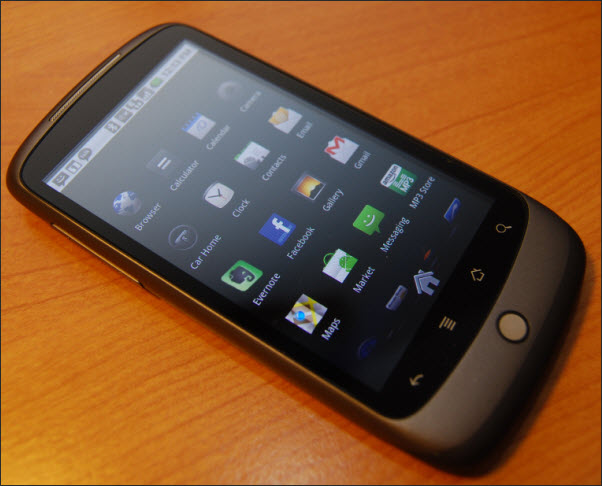
The phone is just plain awesome…
Overall HTC & Google did heck of a job with the aesthetics of the Nexus One. It fits nicely in the palm of your hand and in your pocket. Almost all of the buttons are in a comfortable spot (more in a post that will be published later today). The inclusion of a trackball that acts as a notification system was a very nice touch although I question the use of the trackball to navigate a touchscreen phone.
Check back soon as I will be adding more videos in the next couple of days. For those of you that don’t know what the whole Nexus thing is about, check out the official blog post from Google.
To view more YouTube videos of the Nexus One visit my YouTube Channel @ YouTube/GilsMethod
Does anyone think that this phone is really a superphone? I’d love to hear your thoughts.

