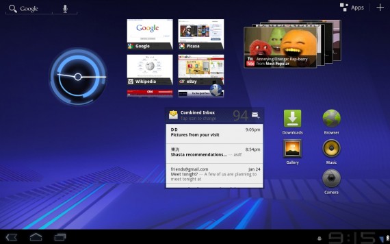
It was less than 2 months ago that Google released the  Android 2.3 Gingerbread OS and already we’re starting to see features from the upcoming version, Android 3.0, codenamed Honeycomb. On January 26, 2011 a preview of the platform became available and revealed some interesting new features, especially for Tablets.
The first new and main feature of Honeycomb is the overall user interface design. On the bottom of the screen you’ll find the System Bar. On the left side of the System Bar you will now find only three buttons: Home, Back and Menu. A simplistic interface with integrated buttons will allow for devices to include less buttons.

Both the System Bar (bottom) and Action Bar (top) will hide when not in use, thus giving you more screen real estate. This is available across the five customizable home screens that come equipped in Honeycomb.
A newly updated keyboard, allowing for a more realistic feel and layout has also been added. Check out the screenshots below for a comparison between the two:
Android 2.3 Gingerbread
 Android 3.0 Honeycomb
 Google has also integrated some of their own services for better usage on the Honeycomb platform, including Google Talk, Google Maps 5, Gmail, Google eBooks, and YouTube. With Google Talk you will be able to Voice Chat, get 3D Maps with Google Maps 5, a seamless integration of Gmail eBooks and a newly redesigned YouTube.
The Motorola Xoom is set to be the debut device for the Honeycomb platform, set to be released on February 17.
You can check out the promo video for Honeycomb below:
You can also check out the whole Android Event (53 minutes) that was held on February 2, 2011:


